12.2.09

Returning

So I've taken a short break from the digital Land of Fantasy. In the mean time, I did a couple of sketches and wrote down some thoughts and ideas I have about stationery and advertisements.

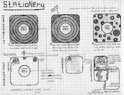
As far as stationery goes, I think this sketch is pretty self explanatory. I'm trying to figure out how to do the stationery in an eco-friendly manner as much as possible, and the idea I have layed out in this sketch would only involve me using very little sticker paper and some ink. The other materials would come from actual record album goods (most likely from vinyls in my collection which I find dispensable)

Envelope=an actual record sleeve (with a circular hole cut-out in the middle...as many have) + sticker for enclosing the top + stamp + printed logo/address in upper left corner

Letterhead= perhaps the back-side of a record sleeve cut off from the front or some recyclable paper of some sort + ink print of design and text

Business Card=a rounded-rectangular cut out from an actual album cover with a sticker containing logo on front +printed info of address/contact/owner name on the blank/cardboard side


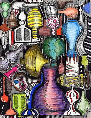
Here are a couple of sketches I've done recently to get some ideas for bottles and jugs and other things I'm making in ceramics.


7.2.09

Logo Transformation

Sketches/Digital files layed out in pretty much the order they were created. Reads like a book from left to right, then down, ending with a photograph I took of my logo printed on some drawing paper that I soaked in tea to get a color close to what I want to use for stationery.


6.2.09

Client No. 2 Refinement

So these are the two prints which I currently have in my portfolio for another rebranding project I worked on last year. The client is a high-end interior design showroom in the Atlanta Decorative Arts Center (ADAC) owned and named by Ernest Gaspard . I'm pretty set on the logo and advertisement designs, but I feel maybe some minor refinements might be necessary later on.

The other items (stationery, specialty piece, brochure) are under construction...It's been a year since I did these things, so I'm taking another look and trying out some new things with these other items. Will post some drafts of these as completed.

Right now, just looking to get some feedback on these close-to-completed prints.

The first is the Company Logo.

The second is a set of three magazine advertisements (8.5 x 11, 3 x 11, 5 x 5)


4.2.09

Stationery Draft

Just altered some secondary type and dimmed the drop shadows a bit on this one.

Note to self...

Logo transformation layout

Ad sketches

Retro texture/Linocut

Stationery Print No. 1

Got a decent layout, so I'm printing this one so I can stand back and look at the design in print form. I'll prob take a picture of the print after I experiment with some different envelopes and papers. That post and more, coming soon to a blog near you...

Stationery Layout. Round No. 1

Going for Simplicity with this design. Threw the layout over some different color swatches to start building a repertoire of colors which work well with the colors from my designs thus far.

Just in case this is confusing in some possible way (can't imagine how, but you never know), the layout order of items from top to bottom is as follows:

1. Envelope (Front/Back)
2. Letterhead (Front/Back)
3. Business Card (Front/Back)


3.2.09

More Stationery

Since the last stationery post, I just moved some things around and added a stamp. I think I'll try some more experimental stuff tomorrow. However, I do want to nail a straight-forward, solid design so I'll have something to fall back on. Last time I took this class and got to the stationery for Ernest Gaspard, i kinda went a little too crazy with cutting a keyhole into the back of the envelope, sewing string with a key on the end that went through the hole, back out around a knob, and you had to unwind the string from the knob...anyway, it was overboard. So for this time around, I want to do something unexpected yet clean and simple.

Square-format Stationery

Playing with Square-format, using the typography from my logo on the envelope/saving graphic for letterhead & type layout for letterhead. I think it might be interesting to play with the idea of including "Greetings from... {Fantasyland Logo}" on either the letterhead or envelope, or both?

I think the logo is too big on the letterhead, and the record falling from the letter "N" should probabaly drop to the starting point of "Greetings Daryl"..I like the fact taht I can use the falling/hanging records for interesting alignment elements, so I think I'm come to the conclusion not to get rid of them in my logo. I don't think I'm quite 100% done with the texture/look of my logo, but after thinking about stationery and other things and the layout of the stationery, I'm pretty set on the design layout of my logo. For now, though, I'm moving on to try out the stationery and advertisements to see what interesting things come out of it. I think that by doing this, the logo/stationery/ads can feed off of one another synonymously.

More to come..

Stationery thoughts

Considering the colors of my logo and the retro feel I'm going after, I'm thinking of using an off-white/cream color for my stationery. I haven't really been so apt for searching out eco-friendly paper, but I think I need to start looking for better choices of environmentally friendly paper sources. I'm thinking that a square format might be interesting, as opposed to the typical 8.5x11 letterhead...this would reference album covers. The format would also mirror my specialty item, which I plan to be some sort of '45 in a record sleeve that's some sort of mailer/advertiser/music sampler. A square format for the letterhead would also be appropriate considering the store owner never has much to say at all...definitely wouldn't need all the space of an 8.5 x 11.

2.2.09

Stationery

Just getting an idea of how the stationery might look like so I can tweek my logo according to how I want it to work with the layout.

And Another..

Logo Adjustments

Still truckin'...not quite there yet, but closer, I feel.

Popular 1970s Color

Avocado Green, Pumpkin Orange, Grape Purple & Harvest Gold

Feedback

I wanted to get feedback from my Uncle who is also very artistic and usually has a good eye for design and always provides me with constructive criticism. Here's what he had to say about my current logo drafts I've been working with....


I love it! It’s very retro. I love the “album” hangie-downs on the letters. The font’s perfect for the time, although a lot of stuff back then was somewhat “fatter”. But that might make this particular design style hard to read.

Just a recommendation from the time period, a lot of rock-and-roll “groovy” stuff was more orange and purple. Maybe if you made the different circles in the half-record at the top different colors? Some big colors of the time were Harvest Gold, Pumpkin Orange, Avocado Green, and Grape Purple.

Or leave all the circle motifs on the record itself Chocolate brown, and make the center record label orange?

As far as spacing, I think the third and forth look best. With the lettering just a touch wider than the album.

What do your parents think? This was most definitely “their era”.

Oh, ok, I should’ve pulled down further. Looks like you already tried the multi-color stuff. I thought the top one was final, until I checked the dates on all the posts were the same. Cool. You’re definitely on target for something perfect.