25.2.09

Final Logo Layout

This has definitely been the most enjoyable logo-creation process I've been through thus far. I think that the dreamy and playful state of mind in which I approached the project, as well as the seemingly infinite numbers of combinations of ideas that have come to mind along the way seem to show through in the final product. So I feel that, final product aside, the actual process of creating this logo was a success.


20.2.09

note to self

make circle containing receiver's address similar to circles from pattern.

Stationery Construction. Round No. 1

Items:

Letterhead (cardstock)
Envelope (eco-friendly craft paper)
Stamp (Epson A4 Adhesive paper)
Enclosing Sticker (Epson A4 Adhesive paper)

Format:

Letterhead= 8.5'' x 8.5''
Envelope= 8.65'' x 8.65''


The first round of experimenting with constructing my stationery was successful for the most part. The logo printed onto the envelope came out a bit too dark. I'm going to have to search around for some different materials for the envelope or try some sort of shinanigans with printing to get it to come out complementary to the other stationery imagery. Other than that, I believe I'm getting rather close.


18.2.09

Closer...

Another stationery layout

Trying to refine the digital layout before I begin to produce the actual stationery in material form.

17.2.09

Another stationery layout

Letterhead

Envelope (*Note: The square at the top center is a sticker which would enclose the 'record sleeve')

Business Card

Left side is Front, Right side is Back.

Monday Sketches

Before Art Monday at Apache, I was groovin' to some Medeski Martin + Wood and did this sketch.


The first of my advertisement ideas for Fantasyland Records. A 'fantasy' landscape made up of elements from the logo.


Sketches from Apache Cafe's figure drawing. For this session, apart from the usual, I didn't have a set plan/technique of how I would portray the model, so I just decided to try and not think about how I wanted to draw but just move the hand not holding the delicious Newcastle around sporadically.


When I got home, I decided to get a mirror and attempt to sketch my face.

16.2.09

13.2.09

Working with record album materials...

...for stationery. Experimentation and Photographation. I think I like where this is going.


Envelope


Business Card


I think I like the business card without the Fantasyland sticker on the colorful side. I'll prob leave the colorful side alone and just put the top, circular pattern part of my logo back on the plain side.

I'm going to search for some album covers which contain colors that fit well with my logo. I just wanted to use this particular cover to experiment with.

Being that these are made of cardboard, they could serve as coasters if they were just a bit larger...hmm..

12.2.09

Returning

So I've taken a short break from the digital Land of Fantasy. In the mean time, I did a couple of sketches and wrote down some thoughts and ideas I have about stationery and advertisements.

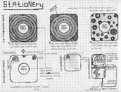
As far as stationery goes, I think this sketch is pretty self explanatory. I'm trying to figure out how to do the stationery in an eco-friendly manner as much as possible, and the idea I have layed out in this sketch would only involve me using very little sticker paper and some ink. The other materials would come from actual record album goods (most likely from vinyls in my collection which I find dispensable)

Envelope=an actual record sleeve (with a circular hole cut-out in the middle...as many have) + sticker for enclosing the top + stamp + printed logo/address in upper left corner

Letterhead= perhaps the back-side of a record sleeve cut off from the front or some recyclable paper of some sort + ink print of design and text

Business Card=a rounded-rectangular cut out from an actual album cover with a sticker containing logo on front +printed info of address/contact/owner name on the blank/cardboard side


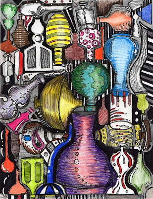
Here are a couple of sketches I've done recently to get some ideas for bottles and jugs and other things I'm making in ceramics.


7.2.09

Logo Transformation

Sketches/Digital files layed out in pretty much the order they were created. Reads like a book from left to right, then down, ending with a photograph I took of my logo printed on some drawing paper that I soaked in tea to get a color close to what I want to use for stationery.


6.2.09

Client No. 2 Refinement

So these are the two prints which I currently have in my portfolio for another rebranding project I worked on last year. The client is a high-end interior design showroom in the Atlanta Decorative Arts Center (ADAC) owned and named by Ernest Gaspard . I'm pretty set on the logo and advertisement designs, but I feel maybe some minor refinements might be necessary later on.

The other items (stationery, specialty piece, brochure) are under construction...It's been a year since I did these things, so I'm taking another look and trying out some new things with these other items. Will post some drafts of these as completed.

Right now, just looking to get some feedback on these close-to-completed prints.

The first is the Company Logo.

The second is a set of three magazine advertisements (8.5 x 11, 3 x 11, 5 x 5)


4.2.09

Stationery Draft

Just altered some secondary type and dimmed the drop shadows a bit on this one.